


Direkt zum Inhalt

Warenkorb

  • Johan Frederik Hartle

    Der geöffnete Raum. Zur Politik der ästhetischen Form

  • Jörg Dünne, Stephan Günzel (Hg.)

    Raumtheorie. Grundlagentexte aus Philosophie und…

  • An Architektur

    An Architektur 16-17

  • Vera Beyer, Jutta Voorhoeve, Anselm…

    Das Bild ist der König. Repräsentation nach Louis Marin

  • An Architektur

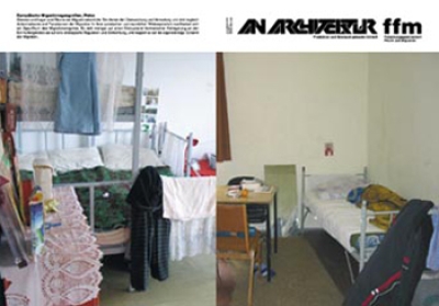
    An Architektur 15 / FFM 11: Europäische…

  • Orhan Esen, Stephan Lanz (Hg)

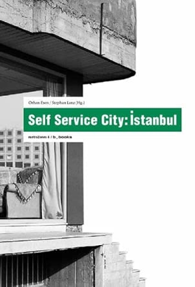
    Self Service City. Istanbul (metrozones 4)

  • An Architektur

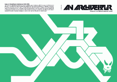
    An Architektur 14: Camp for Oppositional Architecture

  • Stephan Lanz (Hg.)

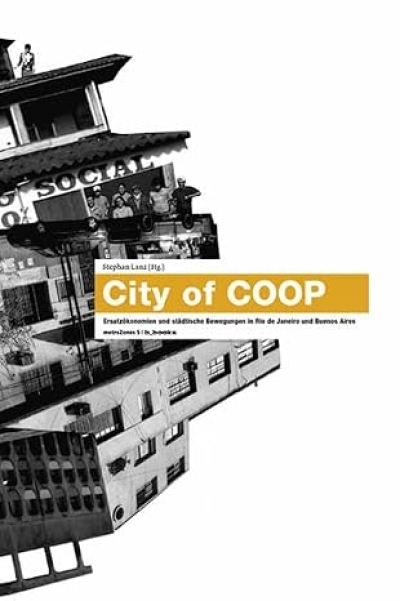
    City of COOP. Ersatzökonomiern und städtische Bewegungen in…

  • An Architektur

    An Architektur 11-13: Theorie und Praxis der Kartografie

  • An Architektur

    An Architektur 10: Gemeinschaftsräume

  • Jochen Becker, Stephan Lanz (Hg.)

    Space//Troubles. Jenseits des Guten Regierens:…

  • Sarai media lab

    Sarai Reader 03: shaping technologies

  • An Architektur

    An Architektur 04-09: Krieg und die Produktion von Raum

  • IDEA Magazine

    IDEA 296. Books <preposition> graphic design

  • IDEA Magazine

    IDEA 293. Stanley Donwood / Vacances. DD-DDD / Dimensions…

  • gerade nicht auf Lager
    An Architektur

    An Architektur 01-03

  • Martina Löw

    Raumsoziologie

  • Pro qm

    Gutschein / Voucher

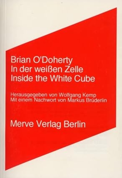
  • Brian O'Doherty

    In der weissen Zelle. Inside the White Cube

  • gerade nicht auf Lager
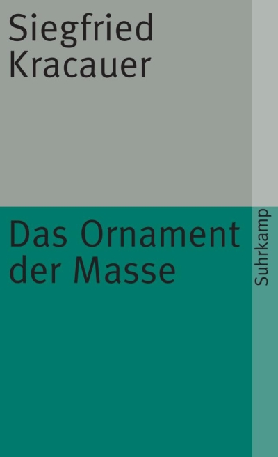
    Siegfried Kracauer

    Das Ornament der Masse. Essays

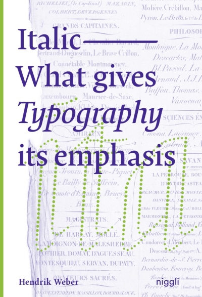
Italic. What gives Typography Its emphasis

The use of italic letters as means of accentuation has become common practice in the digital age. They convey movement and dynamics, address the emotional experience of reading and remind of handwriting. However, this lively characteristic, which once resulted from the movement of the hand, is noticeably lost when words are simply tilted by a mouse click.
To impart knowledge about this typographic feature and to find a general definition as writing style, the author has compiled style patterns to examine the tangible forms, characteristics and functions of "italic nature". Furthermore, he deals intensively with the historical development of italics from handwriting to digital typesetting. This monograph is the first detailed treatise on this topic, and is aimed at all those who deal with letters professionally or privately.


Hendrik Weber
Italic. What gives Typography Its emphasis
Niggli, 2020, 978-3-7212-1009-5
gerade nicht auf Lager