


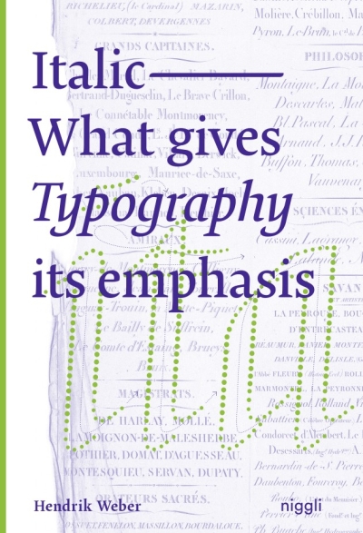
Italic. What gives Typography Its emphasis
The use of italic letters as means of accentuation has become common practice in the digital age. They convey movement and dynamics, address the emotional experience of reading and remind of handwriting. However, this lively characteristic, which once resulted from the movement of the hand, is noticeably lost when words are simply tilted by a mouse click.
To impart knowledge about this typographic feature and to find a general definition as writing style, the author has compiled style patterns to examine the tangible forms, characteristics and functions of "italic nature". Furthermore, he deals intensively with the historical development of italics from handwriting to digital typesetting. This monograph is the first detailed treatise on this topic, and is aimed at all those who deal with letters professionally or privately.